
Pre-stamped offer
CARS24 I Re-commerce
Summary
Removing friction for loan offers on CARS24 app which led to 28% increase in buyer conversion
Resarch I Strategy I UI/UX
Problem statement
There is a lack of visibility and communication about the pre-approved loan offers on the app
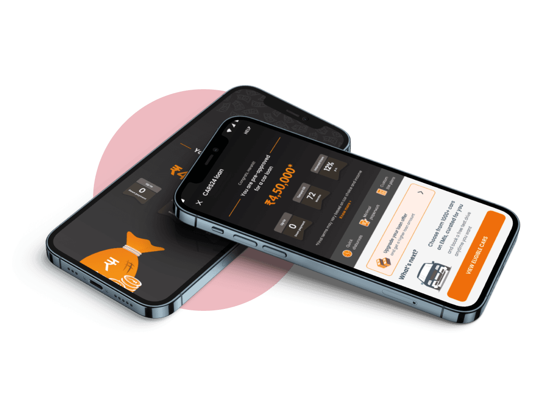
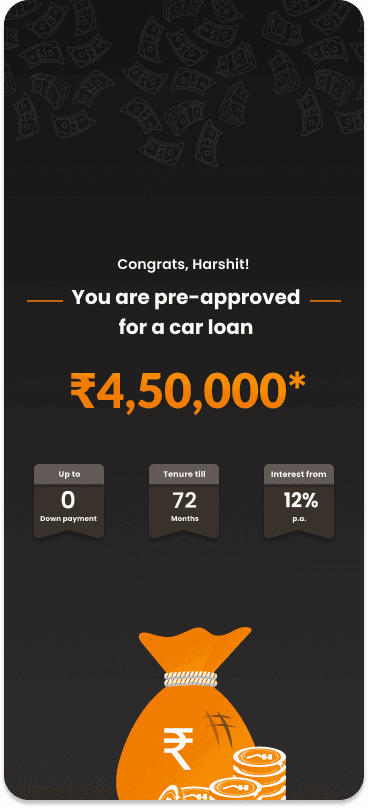
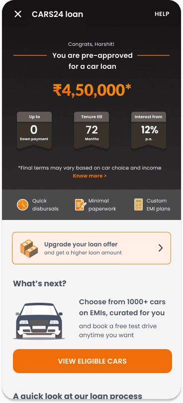
What is a pre-stamped offer?
When the user signs up on our platform for the first time, CARS24 can take their number and run it with one of our finance partner, Bajaj Finserv, to generate a loan offer for them even before they fill any forms.
What was its purpose?
This began with a focus on removing the need to fill PA forms (Pre-approval forms where we ask for PAN details, address and employment) to see a pre-approved offer. This was to remove a high friction point to view Pre-approved offer and increase our bookings
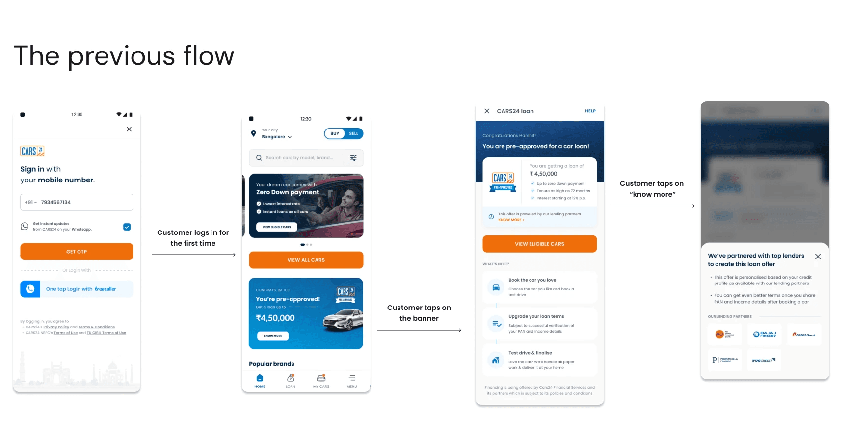
Background
1) Our prior iteration fell short of meeting expected goals, particularly for User to Booking Conversion
2) Beyond the technical issues that prevented a lot of offers from loading, we identified that product flows lacked conviction and excitement due to which they were easily getting missed by customers, resulting in lower engagement
3) Also, the offer value felt low compared to our own in-house pre-approved offer
Issues with previous flow
1) 80% of the customers land on the homepage after login and at this stage it’s important to catch their attention towards the offer
2) No elements/interactions to grab their attention
3) It’s easy to miss the homepage banner as it can go to second fold of the app if customers have seen any cars
4) Since the customers haven’t really interacted with the offer post login, it can be difficult for them to relate or understand the offer when they see a callout in other entry points like CDP, listing or postbooking
5) Most of these journeys were replicated from PA offer but there the customer has already filled the forms and can relate much better with the offer
The following were the main insights from my research
1) Customers were unaware of the offer being there on the app. We showed the pre-approved offer on a banner in home page. It also went down as recently viewed cars were shown if the user had seen some cars.
2) The loan terms are key hooks for the user to continue with the process. However, when they see certain terms change such as down payment, interest rate or the loan amount, it creates distrust towards the brand.
3) There was a misunderstanding with the user about what pre-approved offer meant. Some customers believed that the loan is ready for disbursal, unaware of the prerequisite to avail the offer.
4) 65% users availed the help of car advisors to fill the loan form as they had doubts about what were the next steps to do. The car advisor was their point of contact with the company to resolve their problems
Benchmarking

While comparing with Fintech players provides valuable insights into potential gaps in our loan journeys, it's essential to remember that customer’s loan intent is already high when they open these apps
The E-commerce sector is equally vital to consider. They don't just sell goods; they excel in cross-selling financial services and are masters at engaging customers to purchase complementary services
We aimed to benchmark specific segments of the financing journeys based on this dual character.
Some key learnings from final shortlist
1) Many of the apps in the benchmark had built distinct colour scheme not only differentiates it from other sections of the app but also enables immediate recognition among users. As we pivot towards evolving into a Super App, adopting a unique colour theme becomes crucial.
2) Navi excels in guiding users seamlessly from the initial offer discovery to understanding and eventually finalising the loan offer. Furthermore, Navi effectively utilises banners and widgets to re-engage customers who may have abandoned the process midway, clearly pointing towards the subsequent step in the journey
Change of scope
As we looked at different players and critiqued our previous flow, we realised that there was a need of revamp through out the whole loan journey in our app.
1) A new and distinctive colour scheme for consumer finance on the app
2) Improved discovery with new elements for the user to be aware about the offer
3) Clear communication on next steps on all entry points
4) Helping customers understand the offer by clearly stating that final offers depends on car and income details
5) Offer upgrade flows by allowing users to submit their PAN details
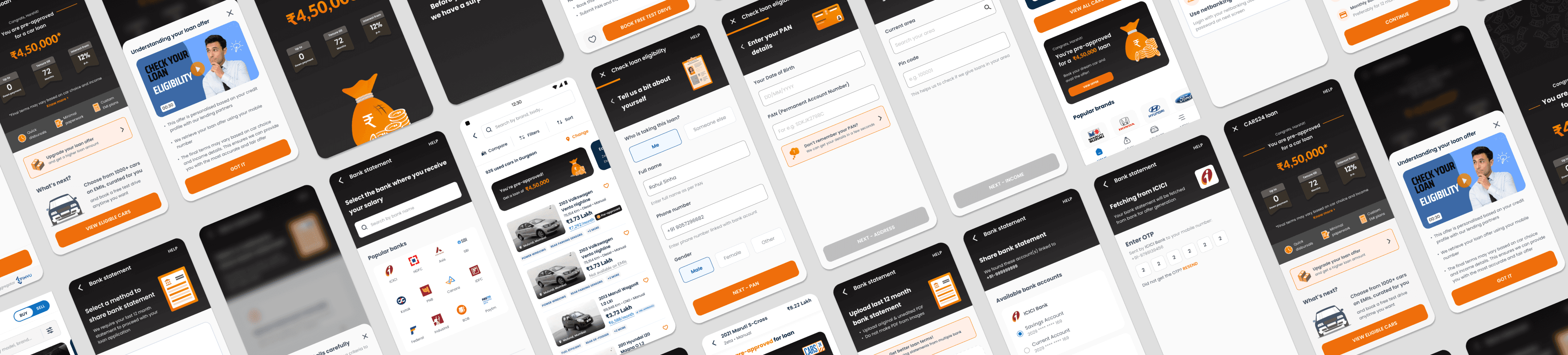
Explorations for new identity
Building a new identity required inspirations and explorations that could help in our purpose.
Different type of illustrations, visuals and depictions were used to help loan journey stand out.
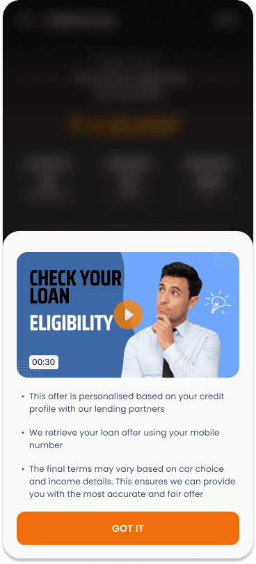
The exploration that you see are of the intercept page that will be shown to the user as soon as they login on our platform.

Through various round of stakeholder meetings and user testing we improved the flows to make it seemless for the users. The structure of the offer page went through drastic change and the end result ensure that it emphasised on two things:
1) The offer and the terms
2) What the user has to do next

...I sketched out ideas on the paper, built the wireframes to bring life to the concepts and worked on the execution of the final work...
...and the following was the end result


Changes done
1) We've taken cues from industry leaders in financial services to redefine our UX. A significant part of this is introducing a standout colour palette exclusively for Consumer Finance journey of the app
2) This aims to enhance the Consumer Finance user experience and bolster brand recall
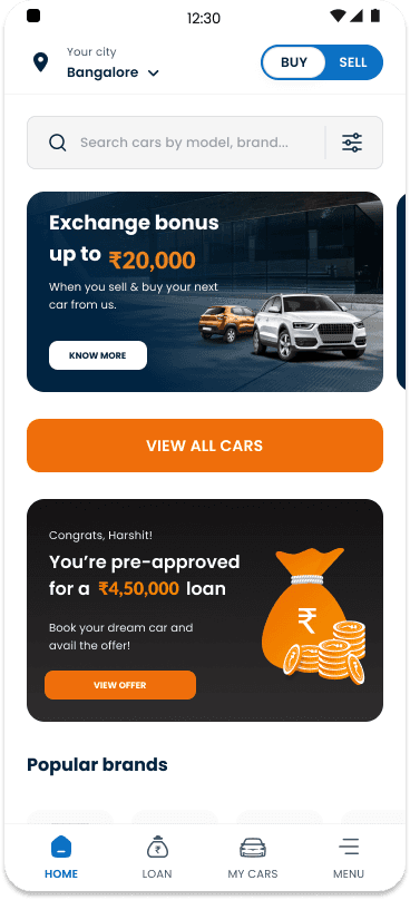
3) We've amplified offer visibility with a full-screen banner and animations upon app login
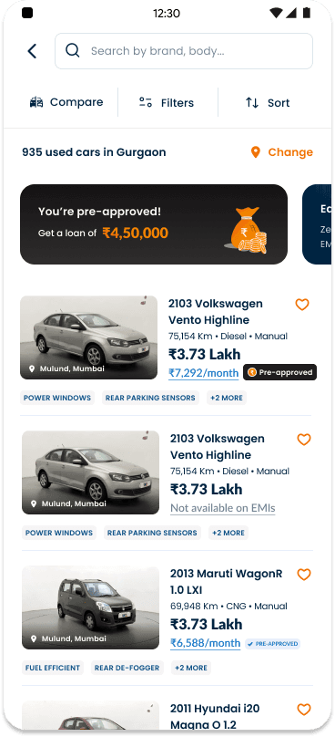
4) A dedicated widget has been added on the Booking Initiation screen for loan offer
5) For those finding the initial offer modest, we've added an 'offer upgrade' feature.
6) By providing their PAN and declaring their income (CF forms), customers can potentially enhance their loan amount
As this project was quite big in scope, we had to divide tasks in phases for implementation. The following were the other aspects
PDF flow revamp
For the generation of a loan offer, users have to share their income proofs with bank statement. One of the ways to share it is by uploading PDF of bank statements

Sharing method
The user is given option to choose his preferred method of sharing

Requirement prompt
List of the requirements in the bank statement is shown for error prevention

Upload page
Apat from the required action, we tell the user what is required and what they can get
Account aggregator revamp
The other way of sharing bank statements is through account aggregators, where the user just shares their bank mobile number and we fetch the bank accounts and statements through OTP. This is possible only if the bank is in the Account Aggregator network

Bank selection screen
The user selects their bank and we see whether it is in their network

OTP screen
The OTP screen is to fetch the statements from the user's bank
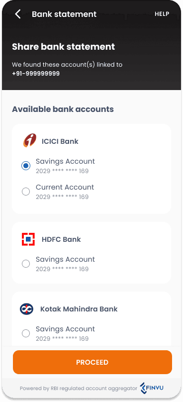
Account selection
The user selects his required bank account from the list to fetch the statements
PA Form revamp
For people who want to upgrade their loan or couldn't get a pre-approved offer, they have to fill self declared forms for their personal details, address and employment record for a loan offer
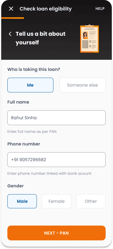
Personal details
The user is asked about their details and PAN if it couldn't be autofetched
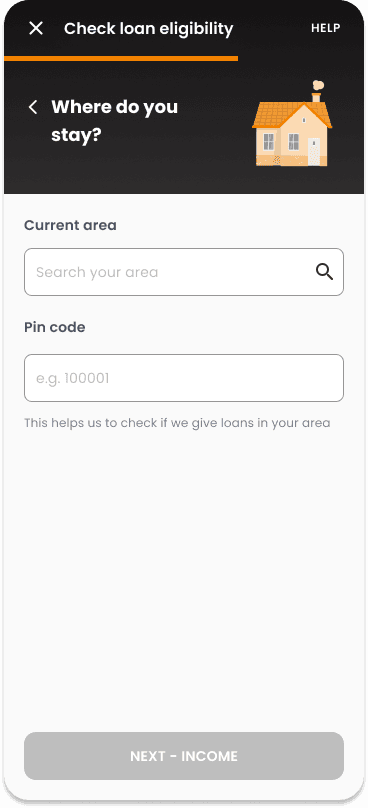
Address details
User's address is asked to make sure that area is eligible for loan disbursal

Employment details
This allows us to understand user's financial history and liabilities for loan generation